The hidden way Bootstrap saved your life
20 Aug 2013
Bootstrap lets anyone build a site that doesn’t look like it should only be served through dial-up. It helps developers without a design background get the basics right, even when they don’t know what those basics are. But, more importantly, it makes the simple option so simple that you can’t help but shelve your ill-conceived plans to reinvent the text box and instead focus on the parts of your site that matter.
I’m not aesthetically blind and I have a degree of visual common sense, intuition and pattern recognition. But I am not a designer. Whilst it’s not helpful to try and put up a wall between Vim-using neckbeard engineers and latte-drinking hipster designers, I haven’t spent much time studying design, so I don’t know very much about it.
The good designers I know have been down many paths many times before. They’ve made their mistakes. They’ve ventured into the deep, dark, dangerous design wilderness and somehow escaped with their lives. They don’t want to go back there anytime soon. Now they can quickly and painlessly produce a standard, pleasant design using simple and effective patterns that they have used before. On the other hand, all of the paths available to me are equally overgrown with weeds and brambles and have bandits and pirates ready to steal my money and kick me in the genitals. Since I don’t know how to build a nice navbar with calming gradients and drop-shadows, I believe that I would find doing so just as hard as completely reinventing the very concept of navigation.

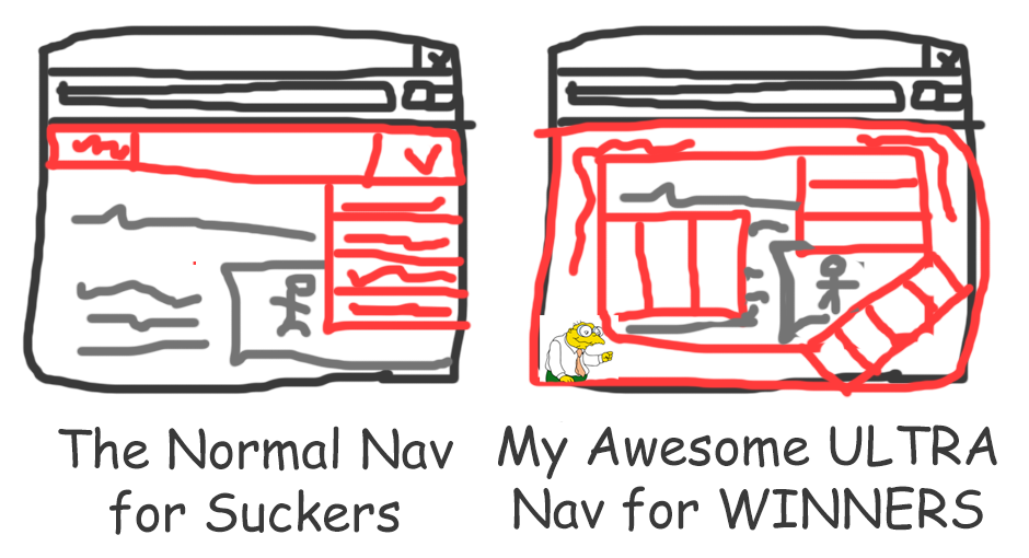
Without a path of least resistance to guide the way, it can be perilously easy to decide that all the professional designers in the world are blind sheeple who haven’t realised that their understanding of the navbar is completely outdated, and that they should be building intricate, dynamic experiences that coil around all 4 sides of the screen.
Trying to build My First Nav Bar will make me feel like I’m wobbling around on my skateboard, strapped up in knee- and elbow-pads, whilst everyone around me is popping backslide double-kickflips like they were going out of fashion. But working on my new multi-dimensional, next-gen ultra-nav will make me feel like an paradigm-busting renegade, shaking up the status quo with no respect for any of your stale, entrenched norms. And maybe your norms actually are indeed both stale and entrenched. Maybe my chaotic, hypnotic, gyroscopic navigational-extravaganza really is the next visual mutation that the pixel-pushers are crying out for. But it probably isn’t, and I’m probably only moments away from getting my teeth knocked out by a passing band of jungle outlaws.
Bootstrap lets people without a grounding in design build a usable, highly functional site without really having to think about it. You don’t have to feel like a rookie building My First Nav Bar, because it’s already there for you. Even when our baseless over-confidence is determined to drown us in a pungent swamp, we blissfully incompetent aesthetic daydreamers are saved from ourselves by pragmatism. The quatro-nav-vortex doesn’t look nearly so attractive when it’s standing next to <div class='nav'></div>. Bootstrap makes using a wheel so easy that you forget to reinvent it.
Bootstrap lets anyone build a site that doesn’t look like it should only be served through dial-up. It helps developers without a design background get the basics right, even when they don’t know what those basics are. But, more importantly, it makes the simple option so simple that you can’t help but shelve your ill-conceived plans to reinvent the text box and instead focus on the parts of your site that matter.
I’m not aesthetically blind and I have a degree of visual common sense, intuition and pattern recognition. But I am not a designer. Whilst it’s not helpful to try and put up a wall between Vim-using neckbeard engineers and latte-drinking hipster designers, I haven’t spent much time studying design, so I don’t know very much about it.
The good designers I know have been down many paths many times before. They’ve made their mistakes. They’ve ventured into the deep, dark, dangerous design wilderness and somehow escaped with their lives. They don’t want to go back there anytime soon. Now they can quickly and painlessly produce a standard, pleasant design using simple and effective patterns that they have used before. On the other hand, all of the paths available to me are equally overgrown with weeds and brambles and have bandits and pirates ready to steal my money and kick me in the genitals. Since I don’t know how to build a nice navbar with calming gradients and drop-shadows, I believe that I would find doing so just as hard as completely reinventing the very concept of navigation.

Without a path of least resistance to guide the way, it can be perilously easy to decide that all the professional designers in the world are blind sheeple who haven’t realised that their understanding of the navbar is completely outdated, and that they should be building intricate, dynamic experiences that coil around all 4 sides of the screen.
Trying to build My First Nav Bar will make me feel like I’m wobbling around on my skateboard, strapped up in knee- and elbow-pads, whilst everyone around me is popping backslide double-kickflips like they were going out of fashion. But working on my new multi-dimensional, next-gen ultra-nav will make me feel like an paradigm-busting renegade, shaking up the status quo with no respect for any of your stale, entrenched norms. And maybe your norms actually are indeed both stale and entrenched. Maybe my chaotic, hypnotic, gyroscopic navigational-extravaganza really is the next visual mutation that the pixel-pushers are crying out for. But it probably isn’t, and I’m probably only moments away from getting my teeth knocked out by a passing band of jungle outlaws.
Bootstrap lets people without a grounding in design build a usable, highly functional site without really having to think about it. You don’t have to feel like a rookie building My First Nav Bar, because it’s already there for you. Even when our baseless over-confidence is determined to drown us in a pungent swamp, we blissfully incompetent aesthetic daydreamers are saved from ourselves by pragmatism. The quatro-nav-vortex doesn’t look nearly so attractive when it’s standing next to <div class='nav'></div>. Bootstrap makes using a wheel so easy that you forget to reinvent it.