How to make yourself happier by making your iPhone worse
18 Mar 2020
I started writing this post while COVID-19 was still just a small item in the “World News” section. I now imagine that many people reading this feel like WhatsApp and Reddit are the only things holding them together. If this is how you feel then keep doing what you’re doing and ignore everything written below that isn’t helpful to you. But if you think you would benefit from re-evaluating how you use your phone then I think this post will help.
If you sometimes feel mentally ripped apart by your smartphone then I don’t think that the solution is a Nokia 3310. Smartphones may be distracting, but they’re also very useful.
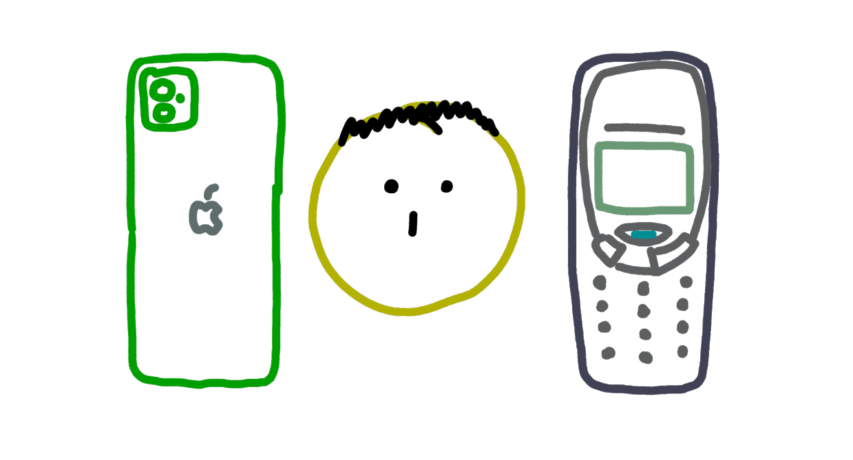
Instead, I think that the way to wrest control back from your pocket is to carefully and deliberately make your silky, liquid device a little less attractive; less compulsive; and overall a little bit worse. Over the years I’ve built up a library of techniques for making my iPhone annoying but available. I can still use apps and browse the internet, but with enough friction to slow me down and make me feel more in charge of where we’re going.
If this sounds appealing then here’s how you can do it too.
Notifications
Let’s start with the basics. We’ll get more quixotic soon.
1. Disable all non-essential notifications
Allow only essential, realtime apps to buzz your pocket. For me this is iMessage, WhatsApp, and phone calls. If your social circle uses other apps, like Messenger or Twitter, for real-time messaging, then maybe you begrudgingly need to give them vibration privileges too.
2. Mute large WhatsApp groups
You might have some apps that you use both for communication that is both realtime (telling your friends that you’re running twenty minutes late), and asynchronous (sending your extended family juicy memes). Consider muting high-volume asynchronous conversations so that you can read them at your leisure and your pocket only buzzes when it really needs you.
3. Remove your primary email account and make a dummy one for sending yourself notes
I love receiving emails as much as the next person (I’d love to hear from you), but I don’t think that this lust is very healthy. A few times I’ve tried adding my primary email account to my phone, and have always felt like doing so reduced my quality of life. Now my phone only has a dummy email account that I use to email myself notes, and which I can technically use to email other people in an absolute emergency (the address is pretty stupid so I try not to). Not having immediate access to my emails is almost never a problem, although I’m sure that this varies by lifestyle. For me the tradeoff is worth it.
Look and feel
Now we start to get a bit more enterprising. Some of these suggestions may not work for you if you have impaired vision.
4. Set the display to black and white
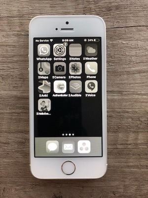
In Settings > Accessibility > Display & Text Size > Color Filters (this and all other settings in this post are for iOS 13.3), you can configure your display to be black and white. This makes your phone look much more drab and boring and makes you correspondingly less likely to accidentally fall down a brightly-colored pit of clickbait. There are admittedly times when you do need pigments, such as when you’re reading a color-coded graph. For these occasions you can turn triple-click-ing the home button into a shortcut for toggling black-and-white mode on and off. This makes it easy to disable, and, more importantly, easy to turn back on once you don’t need colors any more.
Screenshots ignore both black-and-white mode and color inversion (see next tip), so here’s a real-life photo of what it looks like.
5. Invert the display colors
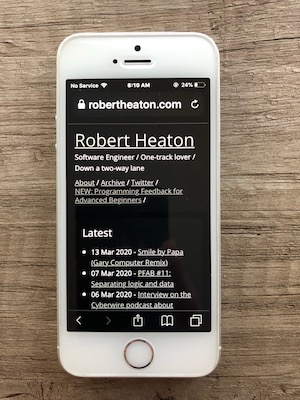
In Settings > Accessibility > Display & Text Size > Smart Invert, you can also invert your display colors, giving you instant dark-mode on many websites and apps. In older versions of iOS this option would invert the colors of icons and photos, making them look quite strange. But new versions offer “Smart Invert” which leaves them untouched, flipping only the colors of text and background colors. Coupled with the black and white setting described above, this makes your screen noticeably more relaxing.
6. Set your background and screensaver to plain black
Most people have their phone background set to a photo of their partner, children, family, pets, favorite landscape, etc. For all the same reasons described above, I prefer to go with a timeless classic - a black rectangle that I snapped by putting my thumb over the camera at nighttime.
7. Set the font size to be unnecessarily large
One day I was on the train. As I assume all people do, I was looking over the shoulders of the people in front of me and following along as they went about their daily online lives. Not exactly ethical, but I had finished my book and they should have had better operational security.
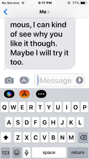
I noticed that the phone of the elderly, bespectacled gentleman to my left was displaying his text messages in a giant font. It looked ridiculous, and I had to know how he did it. I poked around on my own phone and found that in Settings > Accessibility > Display & Text Size > Larger Text you can configure the font size used by system menus and some applications (it doesn’t appear to apply to many apps, including Safari). This makes your phone feel a little more unwieldy, but in what I believe is a good way. It might be a step too far, but I’ve fallen in love and I’m never going back to normal text.
Blocking and limiting
8. Block distracting websites
iOS has a feature called “Content and Privacy Restrictions”, which lets you set website allow- and block-lists. This is presumably meant for locking your children out of online games and particularly grizzly pornography, but you can also use it to put a speed bump in between you and any websites that you feel compelled to visit but that don’t make you happy.
Go to Settings > Screen Time > Content & Privacy Restrictions > Content Restrictions > Web Content and add the domains that you want to block. If you ever want to temporarily unblock them then you can go to Settings > Screen Time > Content & Privacy Restrictions and untick the “Content & Privacy Restrictions” box (you will have to remember to go back and re-enable it afterwards). There’s an option to require a security code to edit these settings which you should enable in order to make disabling the option even more irritating.
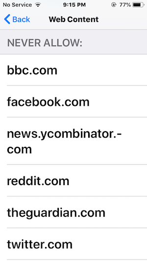
I find that for a few days after I add a new website to the blocklist I continue trying to visit it and running into the wall that I had forgotten I had put up. After a few days I start to learn, and eventually stop going to the website altogether. Since this is a system-level control and not a browser-level one, it even works across all browsers on your phone. This prevents you from accidentally-on-purpose backdoor-ing yourself into a blocked site via the browser built into your podcast app.
9. Set “Downtime” all day for everything
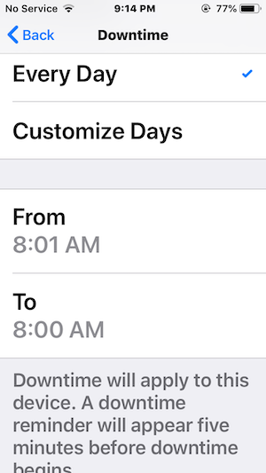
In Settings > Screen Time > Downtime, you can configure “Downtime” for apps and websites. You choose a set of apps and websites, and then each day during a specified period your phone will ask you “are you really sure you want to do this?” before it will consent to open a restricted app or site. App icons are greyed out, and doing anything on your phone takes a few seconds longer. This makes whipping out your phone for a quick scroll through nonsense you don’t actually care about noticeably less enticing. I started using this feature by Downtime-ing strategic apps and websites for a few hours before and after bedtime, but then realized that there was no reason not to enable it all day, for all sites and non-essential apps. Note that Downtime disables notifications for the apps that it applies to, so make sure to set your critical apps to be “Always Allowed”.
10. Hide distracting but necessary apps at the far end of a folder
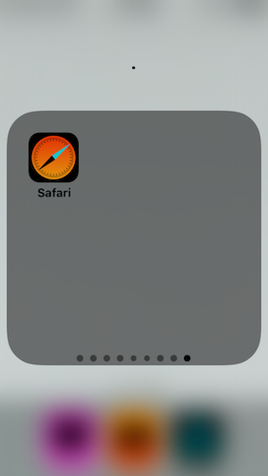
If an app is both distracting and un-necessary, then your first thought should of course be to delete it. But often the same app can be both distracting and helpful; it just depends on the context. I like to keep such apps annoying but available, by hiding them at the far end of a big folder. Put 10 apps into a folder, ideally including some of the default apps that you never use like “Clock”. Drag each app onto its own page in the folder, and put the distracting apps on the pages furthest to the right. This means that in order to use them you will have to open the folder and scroll a long way to the side. It takes me 8 finger strokes to open Safari, and I think that this is a good thing.
Safari
10. Remove bookmarks from the start page
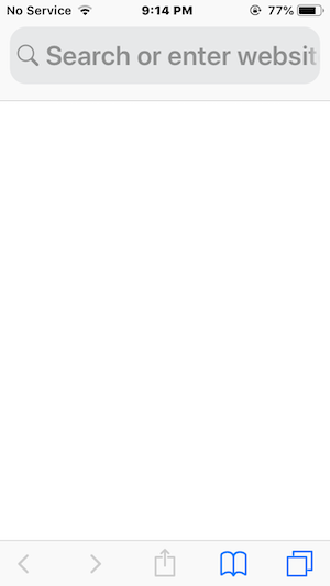
By default, the start page of Safari contains a list of your bookmarks and most viewed pages. I find this to be mostly a distraction. When I open Safari I usually already have a plan, which is not furthered by being nudged to read the New York Times instead. You can disable all of this cruft and make the Safari start page a calming blank sheet in Settings > Safari.
11. Remove auto-predicting from the URL bar
When you type into the Safari URL bar, Safari will often start suggesting pages based on your typing. I find this more distracting than helpful too, since it often leads me somewhere I didn’t intend to go. For now I’ll stick with old-fashioned Google search pages and hope I can tune out all the ads.
A few years ago I published a widely-read rant about how mind-rotting Slack is. In my new capacity as a focus maven I was asked by several companies if I would be interested in trying their new, distraction-free dumb-phones. To my surprise, I realized that I wasn’t. The useful parts of a smartphone are too useful to give up, for any sensible definition of the word. That’s why I think that the antidote to overwhelming tech is turgid tech; stodgy but powerful; awkward but available.
Friction can even feel good when you deliberately sign up for it. But there are limits. For example, you would definitely use your phone less if you disabled fingerprint unlocking. But for me this would be too much awkwardness, indiscriminately applied. Many of the things I use my phone for are life-enhancing; I don’t want to make those more bothersome if I can avoid it.
I wonder what an operating system built around a central principle of least distraction would look like. In the meantime, the above techniques should help. Start at the top.
I started writing this post while COVID-19 was still just a small item in the “World News” section. I now imagine that many people reading this feel like WhatsApp and Reddit are the only things holding them together. If this is how you feel then keep doing what you’re doing and ignore everything written below that isn’t helpful to you. But if you think you would benefit from re-evaluating how you use your phone then I think this post will help.
If you sometimes feel mentally ripped apart by your smartphone then I don’t think that the solution is a Nokia 3310. Smartphones may be distracting, but they’re also very useful.

Instead, I think that the way to wrest control back from your pocket is to carefully and deliberately make your silky, liquid device a little less attractive; less compulsive; and overall a little bit worse. Over the years I’ve built up a library of techniques for making my iPhone annoying but available. I can still use apps and browse the internet, but with enough friction to slow me down and make me feel more in charge of where we’re going.
If this sounds appealing then here’s how you can do it too.
Notifications
Let’s start with the basics. We’ll get more quixotic soon.
1. Disable all non-essential notifications
Allow only essential, realtime apps to buzz your pocket. For me this is iMessage, WhatsApp, and phone calls. If your social circle uses other apps, like Messenger or Twitter, for real-time messaging, then maybe you begrudgingly need to give them vibration privileges too.
2. Mute large WhatsApp groups
You might have some apps that you use both for communication that is both realtime (telling your friends that you’re running twenty minutes late), and asynchronous (sending your extended family juicy memes). Consider muting high-volume asynchronous conversations so that you can read them at your leisure and your pocket only buzzes when it really needs you.
3. Remove your primary email account and make a dummy one for sending yourself notes
I love receiving emails as much as the next person (I’d love to hear from you), but I don’t think that this lust is very healthy. A few times I’ve tried adding my primary email account to my phone, and have always felt like doing so reduced my quality of life. Now my phone only has a dummy email account that I use to email myself notes, and which I can technically use to email other people in an absolute emergency (the address is pretty stupid so I try not to). Not having immediate access to my emails is almost never a problem, although I’m sure that this varies by lifestyle. For me the tradeoff is worth it.
Look and feel
Now we start to get a bit more enterprising. Some of these suggestions may not work for you if you have impaired vision.
4. Set the display to black and white
In Settings > Accessibility > Display & Text Size > Color Filters (this and all other settings in this post are for iOS 13.3), you can configure your display to be black and white. This makes your phone look much more drab and boring and makes you correspondingly less likely to accidentally fall down a brightly-colored pit of clickbait. There are admittedly times when you do need pigments, such as when you’re reading a color-coded graph. For these occasions you can turn triple-click-ing the home button into a shortcut for toggling black-and-white mode on and off. This makes it easy to disable, and, more importantly, easy to turn back on once you don’t need colors any more.
Screenshots ignore both black-and-white mode and color inversion (see next tip), so here’s a real-life photo of what it looks like.

5. Invert the display colors
In Settings > Accessibility > Display & Text Size > Smart Invert, you can also invert your display colors, giving you instant dark-mode on many websites and apps. In older versions of iOS this option would invert the colors of icons and photos, making them look quite strange. But new versions offer “Smart Invert” which leaves them untouched, flipping only the colors of text and background colors. Coupled with the black and white setting described above, this makes your screen noticeably more relaxing.

6. Set your background and screensaver to plain black
Most people have their phone background set to a photo of their partner, children, family, pets, favorite landscape, etc. For all the same reasons described above, I prefer to go with a timeless classic - a black rectangle that I snapped by putting my thumb over the camera at nighttime.
7. Set the font size to be unnecessarily large
One day I was on the train. As I assume all people do, I was looking over the shoulders of the people in front of me and following along as they went about their daily online lives. Not exactly ethical, but I had finished my book and they should have had better operational security.
I noticed that the phone of the elderly, bespectacled gentleman to my left was displaying his text messages in a giant font. It looked ridiculous, and I had to know how he did it. I poked around on my own phone and found that in Settings > Accessibility > Display & Text Size > Larger Text you can configure the font size used by system menus and some applications (it doesn’t appear to apply to many apps, including Safari). This makes your phone feel a little more unwieldy, but in what I believe is a good way. It might be a step too far, but I’ve fallen in love and I’m never going back to normal text.

Blocking and limiting
8. Block distracting websites
iOS has a feature called “Content and Privacy Restrictions”, which lets you set website allow- and block-lists. This is presumably meant for locking your children out of online games and particularly grizzly pornography, but you can also use it to put a speed bump in between you and any websites that you feel compelled to visit but that don’t make you happy.
Go to Settings > Screen Time > Content & Privacy Restrictions > Content Restrictions > Web Content and add the domains that you want to block. If you ever want to temporarily unblock them then you can go to Settings > Screen Time > Content & Privacy Restrictions and untick the “Content & Privacy Restrictions” box (you will have to remember to go back and re-enable it afterwards). There’s an option to require a security code to edit these settings which you should enable in order to make disabling the option even more irritating.

I find that for a few days after I add a new website to the blocklist I continue trying to visit it and running into the wall that I had forgotten I had put up. After a few days I start to learn, and eventually stop going to the website altogether. Since this is a system-level control and not a browser-level one, it even works across all browsers on your phone. This prevents you from accidentally-on-purpose backdoor-ing yourself into a blocked site via the browser built into your podcast app.
9. Set “Downtime” all day for everything
In Settings > Screen Time > Downtime, you can configure “Downtime” for apps and websites. You choose a set of apps and websites, and then each day during a specified period your phone will ask you “are you really sure you want to do this?” before it will consent to open a restricted app or site. App icons are greyed out, and doing anything on your phone takes a few seconds longer. This makes whipping out your phone for a quick scroll through nonsense you don’t actually care about noticeably less enticing. I started using this feature by Downtime-ing strategic apps and websites for a few hours before and after bedtime, but then realized that there was no reason not to enable it all day, for all sites and non-essential apps. Note that Downtime disables notifications for the apps that it applies to, so make sure to set your critical apps to be “Always Allowed”.

10. Hide distracting but necessary apps at the far end of a folder
If an app is both distracting and un-necessary, then your first thought should of course be to delete it. But often the same app can be both distracting and helpful; it just depends on the context. I like to keep such apps annoying but available, by hiding them at the far end of a big folder. Put 10 apps into a folder, ideally including some of the default apps that you never use like “Clock”. Drag each app onto its own page in the folder, and put the distracting apps on the pages furthest to the right. This means that in order to use them you will have to open the folder and scroll a long way to the side. It takes me 8 finger strokes to open Safari, and I think that this is a good thing.

Safari
10. Remove bookmarks from the start page
By default, the start page of Safari contains a list of your bookmarks and most viewed pages. I find this to be mostly a distraction. When I open Safari I usually already have a plan, which is not furthered by being nudged to read the New York Times instead. You can disable all of this cruft and make the Safari start page a calming blank sheet in Settings > Safari.

11. Remove auto-predicting from the URL bar
When you type into the Safari URL bar, Safari will often start suggesting pages based on your typing. I find this more distracting than helpful too, since it often leads me somewhere I didn’t intend to go. For now I’ll stick with old-fashioned Google search pages and hope I can tune out all the ads.
A few years ago I published a widely-read rant about how mind-rotting Slack is. In my new capacity as a focus maven I was asked by several companies if I would be interested in trying their new, distraction-free dumb-phones. To my surprise, I realized that I wasn’t. The useful parts of a smartphone are too useful to give up, for any sensible definition of the word. That’s why I think that the antidote to overwhelming tech is turgid tech; stodgy but powerful; awkward but available.
Friction can even feel good when you deliberately sign up for it. But there are limits. For example, you would definitely use your phone less if you disabled fingerprint unlocking. But for me this would be too much awkwardness, indiscriminately applied. Many of the things I use my phone for are life-enhancing; I don’t want to make those more bothersome if I can avoid it.
I wonder what an operating system built around a central principle of least distraction would look like. In the meantime, the above techniques should help. Start at the top.