What does a 0.01 increase in the Gini Coefficient actually look like?
15 Aug 2018
The Gini Coefficient, a common measurement of inequality, is both extremely simple and completely unintuitive. A country’s Gini Coefficient is a single number between 0 and 1, where 0 corresponds to a society in which everybody earns the exact same amount, and 1 corresponds to a dystopian hellscape in which Mark Zuckerberg gets everything. The values in-between get rather more difficult to describe. A country with a Gini Coefficient of 0.4 is “like, very unequal but still basically functional”, and a country with a Gini of 0.45 is best described as “a bit more unequal than that other country I just mentioned. Basically like Peru, according to the latest World Bank figures. Have you been to Peru? Me neither.”
Many policy decisions come down to a trade-off between short-term growth and equity. Unions, minimum wages, labor regulations and high tax rates are unlikely to boost the economy, at least in the short-term, but we may deem some decrease in overall short-term output to be worth sacrificing in the name of redistribution.
Some people object to the very idea of such growth-equity dilemmas. They point out that growth increases the total size of the pie, making everyone, including the poor, potentially better off. They claim that this makes it myopic to worry about the accelerating wealth of the wealthy. Suffice to say that this is sometimes true and valid, and sometimes misdirection that makes society worse.
For example, a 2017 study from the IMF finds that countries who open up their capital markets to foreign investment typically experience a small, temporary, but real increase in growth, alongside a corresponding increase in income inequality. The authors recommend that countries that want to limit inequality should exercise great care and caution when opening their capital market. They suggest that they design their liberalization programs so as to sacrifice some amount of growth for the sake of some amount of equality, perhaps by focusing on giving more people access to credit before fully opening up markets.
The authors found that countries who opened up their markets increased their Gini Coefficients by an average of 0.01. Since the Gini Coefficient has no obvious intuitive interpretation, I find their conclusions hard to understand and interpret. Is a 0.01 increase in a country’s Gini Coefficient a lot? What does it mean? Is it basically just noise that no one will notice, or will it tear apart civil society? How much growth would be needed in order to counteract it and actually make the fabled little guy better off?
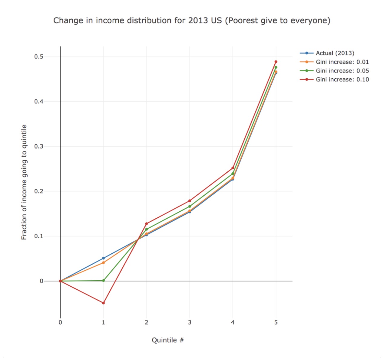
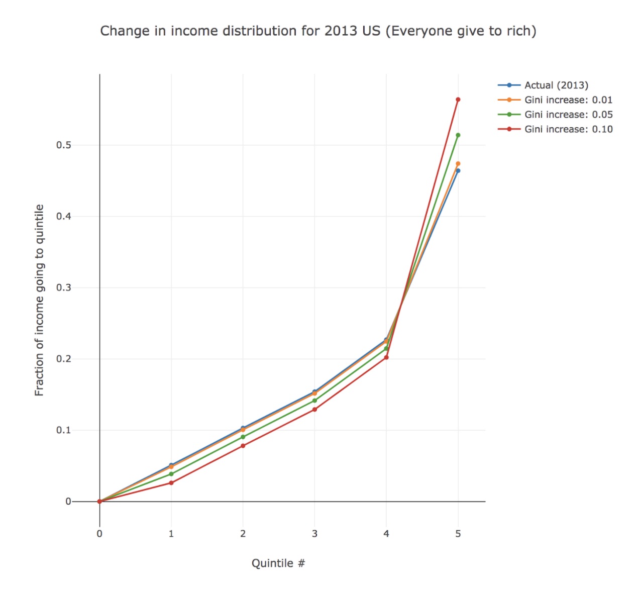
To help improve my intuition about the Gini coefficient, I’ve plotted some graphs. They show the income distribution of the US from 2013, and how this distribution would be changed by increases in the US’s Gini Coefficient. Note that whilst a bump in Gini means that income share has flowed uphill somehow, we can’t know the path that it has taken without seeing the underlying data. Income share could have gone from the poorest to the richest, from the middle-class to the somewhat rich, or from everyone to the ultra-richest. I’ve therefore plotted what would happen to the US income distribution if income share shifted:
- From the poorest quintile to the richest quintile
- From the poorest quintile to all other quintiles equally
- From the bottom 4 quintiles to the richest quintile
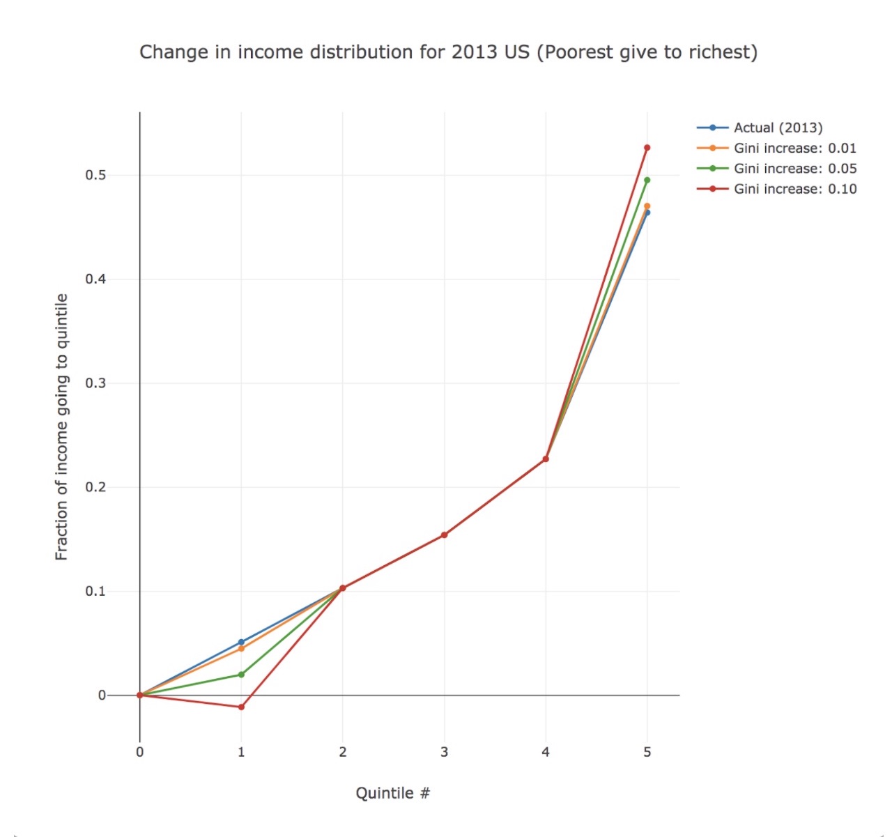
These stylized graphs suggest to me that increases in Gini Coefficient of 0.01 and above are important and likely to have tangible consequences that need to be mitigated. This is especially true if a significant portion of the income share transfer to the rich is borne by the poorest, rather than the middle class. When an increase in Gini Coefficient is effected by an income share transfer from the poorest quintile to the richest, a bump in Gini Coefficient of 0.01 corresponds to a transfer in income share of 0.25% of the total income of the country. In the US, where the poorest quintile start with only 8.35% of the total income, this is a 3% drop in their share.
This cannot be dismissed as noise or the cost of doing more business. In order for such a decrease in the poor’s income share to be acceptable, there had better be a truly edible expansion of the overall pie, and a fully potable rise in trickle-down wealth. Without any countervailing measures or economic growth that actually reaches them, increases in inequality can constitute a real hit for low-income people who are likely already struggling. It doesn’t take many 3% squeezes before the situation becomes truly ruinous. It seems to me that an increase in Gini Coefficient of 0.01 can be both statistically and culturally significant. An increase of 0.05 is likely to be profound, and an increase of 0.1 society-warping.
Code: https://gist.github.com/robert/7eee027244f81523e57b1f3df32cb6a2
Data: World Bank
The Gini Coefficient, a common measurement of inequality, is both extremely simple and completely unintuitive. A country’s Gini Coefficient is a single number between 0 and 1, where 0 corresponds to a society in which everybody earns the exact same amount, and 1 corresponds to a dystopian hellscape in which Mark Zuckerberg gets everything. The values in-between get rather more difficult to describe. A country with a Gini Coefficient of 0.4 is “like, very unequal but still basically functional”, and a country with a Gini of 0.45 is best described as “a bit more unequal than that other country I just mentioned. Basically like Peru, according to the latest World Bank figures. Have you been to Peru? Me neither.”
Many policy decisions come down to a trade-off between short-term growth and equity. Unions, minimum wages, labor regulations and high tax rates are unlikely to boost the economy, at least in the short-term, but we may deem some decrease in overall short-term output to be worth sacrificing in the name of redistribution.
Some people object to the very idea of such growth-equity dilemmas. They point out that growth increases the total size of the pie, making everyone, including the poor, potentially better off. They claim that this makes it myopic to worry about the accelerating wealth of the wealthy. Suffice to say that this is sometimes true and valid, and sometimes misdirection that makes society worse.
For example, a 2017 study from the IMF finds that countries who open up their capital markets to foreign investment typically experience a small, temporary, but real increase in growth, alongside a corresponding increase in income inequality. The authors recommend that countries that want to limit inequality should exercise great care and caution when opening their capital market. They suggest that they design their liberalization programs so as to sacrifice some amount of growth for the sake of some amount of equality, perhaps by focusing on giving more people access to credit before fully opening up markets.
The authors found that countries who opened up their markets increased their Gini Coefficients by an average of 0.01. Since the Gini Coefficient has no obvious intuitive interpretation, I find their conclusions hard to understand and interpret. Is a 0.01 increase in a country’s Gini Coefficient a lot? What does it mean? Is it basically just noise that no one will notice, or will it tear apart civil society? How much growth would be needed in order to counteract it and actually make the fabled little guy better off?
To help improve my intuition about the Gini coefficient, I’ve plotted some graphs. They show the income distribution of the US from 2013, and how this distribution would be changed by increases in the US’s Gini Coefficient. Note that whilst a bump in Gini means that income share has flowed uphill somehow, we can’t know the path that it has taken without seeing the underlying data. Income share could have gone from the poorest to the richest, from the middle-class to the somewhat rich, or from everyone to the ultra-richest. I’ve therefore plotted what would happen to the US income distribution if income share shifted:
- From the poorest quintile to the richest quintile
- From the poorest quintile to all other quintiles equally
- From the bottom 4 quintiles to the richest quintile
These stylized graphs suggest to me that increases in Gini Coefficient of 0.01 and above are important and likely to have tangible consequences that need to be mitigated. This is especially true if a significant portion of the income share transfer to the rich is borne by the poorest, rather than the middle class. When an increase in Gini Coefficient is effected by an income share transfer from the poorest quintile to the richest, a bump in Gini Coefficient of 0.01 corresponds to a transfer in income share of 0.25% of the total income of the country. In the US, where the poorest quintile start with only 8.35% of the total income, this is a 3% drop in their share.
This cannot be dismissed as noise or the cost of doing more business. In order for such a decrease in the poor’s income share to be acceptable, there had better be a truly edible expansion of the overall pie, and a fully potable rise in trickle-down wealth. Without any countervailing measures or economic growth that actually reaches them, increases in inequality can constitute a real hit for low-income people who are likely already struggling. It doesn’t take many 3% squeezes before the situation becomes truly ruinous. It seems to me that an increase in Gini Coefficient of 0.01 can be both statistically and culturally significant. An increase of 0.05 is likely to be profound, and an increase of 0.1 society-warping.
Code: https://gist.github.com/robert/7eee027244f81523e57b1f3df32cb6a2
Data: World Bank