Open Source for Advanced Beginners #1: bashplotlib
14 Apr 2019
This is a project for advanced beginner programmers.
The goal of this project is to help you make the leap from small practice exercises to complex, thorny programs like what you might encounter in your first future programming job. I’ve found an accessible open source library and have written 7 detailed feature requests for it. Your task is to read the library’s code, understand it, and write these features. You’ll get plenty of guidance along the way, but not too much, and you’ll have to do all the difficult bits yourself. I’ve written more about why and how I think this project will help you go from Advanced Beginner to Beginning Advanced here.
We’re going to be working with bashplotlib, a Python library that displays ASCII graphs in the terminal. Created by Greg Lamp, it is small, approachable, and sensibly-written, whilst still having plenty of room for improvement in both its code and functionality.
We’re going to make bashplotlib’s graphs look more attractive; add automated unit tests; and even add an entirely new graph type. We’ll learn how to search through a new codebase; when and when not to worry about code duplication; and how to safely change the way that a program is structured. After each task I’ve written pull requests (PRs) on GitHub to show you what I would do. You can use these PRs to help you out if you get stuck and to compare notes once you’re done.
Before we begin, let’s do some quick setup.
Setup
I’ve “forked” (git’s word for “made my own copy of”) the bashplotlib repo and put it on my GitHub account. I did this so that no one else can sneak in and implement the 7 features in this project before you’ve had a chance to. By the time you read this, the code in the main bashplotlib repo may have changed significantly, but my fork will stay exactly the same forever.
Here’s how to get bashplotlib set up on your computer.
Task A: Fork your own version of bashplotlib on GitHub
(optional but recommended)
I recommend that you fork your own version of my fork. This will allow you to practice using git to push your work back up to GitHub, and will also allow you to show the world what you’ve been working on. If you can’t or don’t want to do this then you can skip to step 3 and clone my version of bashplotlib directly. Don’t worry about breaking anything; GitHub wouldn’t let you mess up my version even if you wanted to. To fork your own bashplotlib repo:
- If you don’t have a GitHub account, create one. Follow GitHub’s instructions for linking your computer to your account. When following the instructions, note that we’re going to do our cloning using HTTPS, not SSH.
- Go to https://github.com/robert/bashplotlib and click “Fork”. This will create your own copy of the
bashplotlib repo.
Task B: Clone bashplotlib
To clone bashplotlib and copy the files onto your computer:
- In your terminal,
cd to the directory you want to work in (eg. cd ~/Documents/Programming)
- If you forked your own version of
bashplotlib in the previous section, clone it by running the command:
git clone https://github.com:$YOUR_GITHUB_NAME/bashplotlib.git
If you didn't fork your own version, clone my version by running:
git clone https://github.com:robert/bashplotlib.git
If you can't get cloning to work, despite having wasted your whole goddamn afternoon trying, you can download the code as a standard zip file by clicking on the Clone or download button on https://github.com/robert/bashplotlib.
Task C: Set up a scratch file
The rigorous best practice for working with Python libraries is to use a tool called virtualenv. If you want to try setting it up then you can follow the instructions here, but for now I recommend saving yourself the potential frustration and heartache of installing a new tool and following these simpler and perfectly valid steps instead:
- In your terminal,
cd into the new directory you just created by your clone operation (eg. cd ./bashplotlib)
- Make a scratch Python file. The name isn't important;
scratch.py is fine.
- Copy this code into it:
# scratch.py
from bashplotlib.scatterplot import plot_scatter

x_coords = [-10,20,30]
y_coords = [-10,20,30]
width = 10
char = 'x'
color = 'default'
title = 'My Test Graph'

plot_scatter(
    None,
    x_coords,
    y_coords,
    width,
    char,
    color,
    title)
- Run this code with the command
python ./scratch.py. If the command prints a scatterplot then your setup is complete and you're ready to take on the world. If something goes wrong then congratulations, you get to practice your debugging skills to try and figure out what. Send me a message if you get stuck.
Let’s start small and get warmed up.
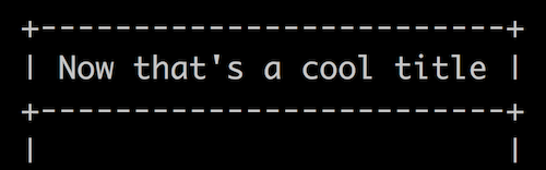
1. Make the title box more stylish
bashplotlib displays its graph titles in a moderately nice-looking box:
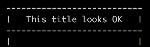
Task
Let’s make these titles a bit more eye-catching. The way that the box edges smash into each other in the corners is too harsh. Let’s replace the corners with plus-signs so that the lines merge nicely with each other instead.
Tips
Open bashplotlib/scatterplot.py and have a look around. Where is the code that prints the title box?
Once you’ve found the box-printing code, you’ll see that it uses a function that is defined in another file in the bashplotlib project. Which file? Use your text editor’s “Find in project” (or similar) feature, and locate the function’s code. (Hint - if you want to find where a Python function is defined, search for "def my_function_name" instead of just my_function_name)
Once you believe you’ve found the box-generating function, make sure that you really have found it by changing some of the function’s code. For example, change the function so that the sides of the box are displayed using the ^ character instead of the |. Run your scratch file (cd to the root of the bashplotlib project and run python ./scratch.py), and make sure that the output is what you expect to be. If it is, you know you’re in the right place. If it isn’t, work out why.
Now that you’ve found the piece of code that builds the title box, you’re ready to change it so that it puts plus-signs in the box’s corners. Go ahead.
Make sure that you don’t accidentally break anything in the process. For example, make sure that the title box stays the same width as the graph, and that the text inside the box stays centered. If we had unit tests then we wouldn’t have to worry about accidentally breaking anything, because our tests would tell us if we had. We’re going to write some unit tests in section 4 of this project, but unfortunately we don’t have any yet. For now you’ll just have to be extra careful and manually check your work.
How I did it
Extensions
Done it? Congratulations! Keep going; add further embellishments as your personal taste dictates. For example:
- Work out how to left- and right-align the title text. Allow users to choose between left-, right-, and centre-align by passing in a
title_align parameter to the plot_scatter function.
- If the title is longer than the width of the graph, truncate it and add ellipses (
…) instead of overflowing.
- Add 2 layers of edging, like so:
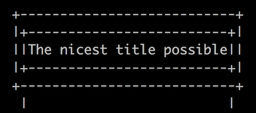
- Use your imagination! Make the title as elegant and beautiful as you can.
2. Label the axes
bashplotlib’s graphs are very clear, but the axes don’t have titles. This makes it hard to know what a graph is trying to tell you. Does that y-axis represent GDP growth or the amount of carbon it the atmosphere? Are the units percent, parts-per-million, or years-until-extinction?
Task
Let’s add the ability to optionally pass in titles for the x- and y-axes of scatterplots, and display these titles like so:
In addition, let’s add --xtitle and --ytitle options to the command line interface at the bottom of the scatterplot.py file so that the command line tool can use them too.
Tips
Feel free to tidy up the code a little if it helps you understand it. I personally felt like len(get_scale(xs, False, size) was being written out too many times, so I assigned its result to a variable at the top of the _plot_scatter function and used that throughout the rest of the function.
How I did it
Extensions
Save space and show off your skills by printing the y-axis title vertically down the side of the graph, like so:

3. Show the 0-axes in the middle of the graph
The README for bashplotlib shows an example scatterplot that has its “0-axes” (lines showing where the axes cross 0) displayed in the middle of the graph:
However, it seems that somewhere the code that creates these 0-axes got lost (nb. I did not delete the code for teaching purposes, it really does seem to have got lost).
Task
0-axes can be very useful for interpreting graphs, so let’s add them back in. Here’s how our 0-axes should work:
- If our data points cross the x-axis, we should print a 0-axis for the x-axis (eg. (-10, 10), (-5, 15), (0, 20), (5, 25)). If they cross the y-axis, we should print a 0-axis for the y-axis too (eg. (-10, -10), (-5, -5), (0, 0), (5, 5))
- We should only print a 0-axis if our data points cross 0 for an axis. If our data doesn’t cross 0, we shouldn’t print a 0-axis
- If we print 0-axes for both the x- and y-axes, we should print an
O where they cross
- If there is a data point on top of an axis line, we should make sure to print the data point and not the axis line
Tips
When I was working on this feature myself, I realized that I had to actually work out what the double-nested-for-loop inside the _plot_scatter function was doing. Up until this point I hadn’t needed to, so I hadn’t bothered. I added a few comments and tweaked the code slightly to make it easier for me to understand. Feel free to do this yourself if it helps you.
How I did it
Extensions
Allow users to hide these new axes if they pass an optional hide_zero_axes argument into the plot_scatter function. 0-axes should be displayed by default, so the default value for this argument should be False.
4. Make the library “testable” and write some tests
Making changes to any codebase, especially a large, unfamiliar one, can be unnerving. You may have successfully added your new feature, but how do you know that it works correctly with every possible edge-case? And how do you know that you haven’t inadvertently broken an already existing feature in some subtle (or not-so-subtle) but important way?
The slow, unscalable, error-prone way to test your code is to manually run it using lots of different combinations of parameters, and laboriously check that everything looks correct. This is better than not testing at all, but does nothing to prevent someone else from unwittingly breaking your new feature in the future.
The solution is “unit tests”. A unit test is a block of code that calls functions from your main code, and verifies that these functions behave correctly. For example, if you wanted to check the correctness of a new function called sum_digits, which takes a number and returns the sum of its digits (in base 10), one of your tests might be:
result = sum_digits(543)
expected_result = 12

if result == expected_result:
    print("SUCCESS!")
else:
    print("FAILURE!")
    print("Expected:")
    print(expected_result)
    print("Got:")
    print(result)
You might also write other tests that make sure that sum_digits works correctly for other types of number, like negative numbers, decimals, and the number 0.
Unit tests make verifying the correctness of your code much quicker and more reliable - all you have to do is run your test file and make sure none of the tests fail. It also means that future people who work with your code (including yourself) will know how it’s meant to behave, and will be less likely to accidentally break it.
At Stripe, where I work, I would guess that the codebase has well over 10,000 tests, and maybe many more. This means that anyone can add new features and update existing ones, without being unduly concerned that they will unwittingly destroy the company.
Making bashplotlib “testable”
bashplotlib does not currently have any tests. This is a perfectly reasonable choice by the author. Writing and maintaining tests takes time, and he probably felt that the library was small and experimental enough that he didn’t want the bother. Nonetheless, adding tests would make the library more reliable and easier to work with. While I was writing this project I noticed and fixed a small bug that would have been caught automatically if the library had had any tests.
However, right now bashplotlib is not very “testable”. A piece of code’s “testability” is how easy it is to write tests for. There are many reasons why a piece of code might or might not be testable. bashplotlib’s main problem is that it prints all of its output to the terminal piece-by-piece. Automated tests for the current version of bashplotlib would have to somehow read in output that had previously been printed to the terminal. There are ways to do this (or something close to it), but they are somewhat complicated and fiddly. There is a better solution.
Task
In this task we’ll first make bashplotlib testable, and then we’ll write tests for it.
We’ll make bashplotlib “testable” by changing the _plot_scatter function so that it no longer prints the graph, but instead builds and returns the graph as a long string. The plot_scatter function (which calls _plot_scatter) will then be responsible for printing this long string to the terminal:
def _plot_scatter(...arguments, etc...)
    graph = ""
    # ...build a graph...
    graph += "+---+etc"
    # ...build the rest of the graph...
    return graph

def plot_scatter(...arguments, etc...)
    # ...process arguments...
    graph_text = _plot_scatter(...arguments, etc...)
    print(graph_text)
This seemingly minor shuffling of responsibilities makes the _plot_scatter function much easier to test. Now we can write test code that calls _plot_scatter, stores the result in a variable, and compares this result to a pre-defined, expected value. For example, in a new file called test.py, we can write:
# test.py
from bashplotlib import _plot_scatter

# Copy and paste the value for `expected_result`
# from terminal output that you know is correct.
expected_result = """+--------...
|
...etc...
|
+--------..."""
# Call `_plot_scatter` with the arguments that
# you know will produce the `expected_result`
# above.
result = _plot_scatter(...arguments, etc...)

if expected_result == result:
    print("SUCCESS!")
else:
    print("FAILURE!")
    print("Expected:")
    print(expected_result)
    print("Found:")
    print(result)
Think of as many edge-cases as you can, and write individual tests for them all.
Tips
I suggest that you tackle this task using the following steps:
- Change
_plot_scatter so that it returns a string representing the graph, and doesn’t print anything
- Change
plot_scatter so that it stores and prints the output of _plot_scatter
- Make a new file called
test.py in the root of the library (alongside scratch.py)
- Write a test for
_plot_scatter to make sure that it generates a normal graph correctly. Run it using python ./test.py
- Think of as many edge-cases as you can, and write tests for them. Do your 0-axes display properly? What if a point is on top of a 0-axis? What happens if your title is longer than the width of the graph? Is this what you want to happen? What if you have 2 data points that are the same? Almost the same?
Your tests might have trouble interpreting color printing. Feel free to get rid of the color-printing functionality for now, or look at my version for suggestions on how to deal with it.
For another example of unit testing, see section 3 of Programming Projects for Advanced Beginners #2: Game of Life.
How I did it
Extension
Research PyUnit, a Python testing framework, and rewrite our tests with it. Although our hand-crafted if-statements are perfectly serviceable, most test suites are written using a testing framework (like PyUnit), which makes writing, running, and debugging tests much easier.
5. Make histograms more stylish too
So far all of our work has been on improving scatterplots. But bashplotlib can plot histograms too. Technically they’re not actually histograms; the y-axis in bashplotlib’s graphs represents a raw count, whereas in a histogram the y-axis represents “probability density”. “Bar charts” would be a more accurate word for what bashplotlib produces. But I think everyone still understands what the library is getting at, so let’s not say anything nasty on Twitter. For consistency I’m going to keep referring to them as “histograms”.
Task
bashplotlib’s histograms generate their titles using the same box_title function that we worked on in step 1, so they automatically benefit from our previous work. However, histograms also display a statistical summary of their data, in another box below the main graph. This box is generated by hand. We’ve already got a good way of printing text inside beautiful ASCII boxes, so let’s use this method here too. This will make our statistics look more elegant and consistent, and reduce code duplication
To work on histograms, you’ll have to call plot_hist from your scratch.py file. Try to set this up yourself.
Tips
We have a small problem - box_text currently assumes that you only want to print a single line inside your box, but our statistics are spread out over multiple lines. To solve this snafu, update box_text so that the argument it accepts is a list of strings, not just a single string. Have the function display each element of the list on a separate line, and surround all the lines with an ASCII box. We’ll then use the function to create our stats box like so:
center = ... # Defined earlier in the file
summary_lines = [
    "## Summary ##".center(center),
    ("observations: %d" % n).center(center),
    # ...etc...
]
print(box_text(summary_lines, center))
To maintain compatibility with our existing code, update the places where box_text is used for displaying titles so that the titles are passed in as a single element list, like this:
box_text([title])
How I did it
Extension
Because we’re now using the box_text function to render the histogram statistics box, we no longer get an emphasizing line in between “Summary” and “observations” (see picture above). I thought that line looked quite fetching, so let’s bring it back. Update box_text so that it takes an argument of a “list of lists”. box_text should print out each line in the sub-lists, as normal, but in between each top level list it should print an ASCII line. For example, the code:
box_text([
  ["Title"],
  ["Sub-title1", Sub-title2"],
  ["Point1", "Point2", "Point3"]
])
should produce the output:
+----------+
|   Title  |
+----------+
|Sub-title1|
|Sub-title2|
+----------+
|  Point1  |
|  Point2  |
|  Point3  |
+----------+
Make sure all the other usages of box_text still work.
6. Add labels to histogram axes
Task
Do the same thing that you did in task 2 - add optional titles to the x- and y-axes - but this time for histograms. It’s a lot easier the second time round, isn’t it?
Tips
You’ll probably find that you repeat code between the scatterplot.py and histogram.py files. Repeating code like this should always make you feel a little bit uncomfortable, and should prompt you to consider ways to reduce or eliminate the duplication. That said, sometimes repeating code can be an entirely pragmatic choice.
In our situation, we could either try to wrap up our axis title code in some sort of print_axis_title function that lives in utils/helpers.py, or we could copy and paste and duplicate our code in both scatterplot.py and histogram.py. For this task, I could personally go either way. On the one hand, it’s always good to reduce repeated code. But on the other hand, it’s not obvious to me that scatterplots and histograms will always and forever want to use the same logic for printing their axis labels. For example, what happens if one of them wants to print some extra characters on the same line as the axis label? We’d probably have to add something convoluted like optional extra_chars_left and extra_chars_right parameters. Trying to combine two pieces of code that might not be as combine-able as they first appear can lead to some awkward approaches. Since the code for printing axis labels is relatively simple anyway, on this occasion I lean in favor of copying and pasting.
I’m still glad that I thought about it though.
How I did it
I reckon you can tackle this one on your own.
Extension
I’ve got nothing. Call your parents and see how they’re doing.
7. Make a new graph type: horizontal histogram
This is my final feature request, and it’s a big one.
Task
Let’s allow users to draw horizontal histograms:
This will help users display big, detailed histograms that are too tall for their short and stocky terminals, but that fit nicely when rotated.
Tips
This will be very hard. Take inspiration from histogram.py, but not too much inspiration. Feel free to start from scratch if you prefer. I’d suggest that you:
- Copy and paste
histogram.py into a new horizontal_histogram.py file
- Make sure you can import
horizontal_histogram.py and run its code in scratch.py. Test it by using it to draw some normal, still-vertical histograms
- Think about which parts of the vertical histogram code you can reuse, and which parts will have to change. In general you’ll be able to reuse the parts of the code that deal with transforming and bucketing the data (everything above line 140 or so), since the underlying data doesn’t change. However, you will have to rewrite the parts that take the transformed data and display it as a graph (everything below line 140). For now, use copy and paste liberally and don’t worry about duplicating code.
- Once you’ve got your horizontal histogram working, write some tests for it!
How I did it
Extensions
Pull out as much duplicated code as you can from vertical and horizontal histograms, and move it into shared functions. These functions might perform common operations like bucketing data points and calculating scales.
8. Even more extensions
- Calculate the “correlation” of scatter graphs using the “product moment correlation coefficient” algorithm and print it in a box below the plot. Research what these words mean. You can either look for an existing implementation of the algorithm and use that, or try to code it yourself from scratch (this involves a lot of very tricky but very interesting maths).
- Calculate the “interquartile range” of histogram data and display it in the same box as the mean, median, standard deviation, etc. If you’re not sure what that means, look it up!
- Use ASCII techniques to connect the dots in scatter plots. You’ll have to work out which points need to be joined together, calculate the gradient between them, and work out how best to connect them using ASCII characters.
- Draw ASCII pie charts. Add a new
bashplotlib/pie_chart.py file to put the logic in, and add a new pie command-line tool
That’s it
You’re done! Keep the momentum going - choose another open source project (use Google and this list for inspiration) and add experimental new features to it. Don’t worry much about actually submitting your work to the main project (unless you want to) - your goal should be to understand and experiment with new projects, not to produce something polished and perfect and ready to be deployed to production servers. Alternatively, try tackling the Programming Projects for Advanced Beginners series, where you build your own programs from scratch using a similar level of detailed (but not too detailed) guidance to that of this project.
I’d love to hear your feedback and find out how you got on. Send me an email or a Tweet (with a link to your GitHub repo if you have one) and I’ll send you back some insightful comments and a ASCII art trophy.
NEW
Subscribe to my new "Programming Feedback for Advanced Beginners"
newsletter to receive concise weekly emails containing specific,
real-world ways to make your code cleaner and more professional.
Each week I review code sent to me by one of my readers. I highlight
the things that I like, discuss the
things that I think could be better, and offer suggestions for how
the author could make their code cleaner and easier to work with.
Subscribe now to receive these invaluable improvements in your inbox
every week, completely free.
This is a project for advanced beginner programmers.
The goal of this project is to help you make the leap from small practice exercises to complex, thorny programs like what you might encounter in your first future programming job. I’ve found an accessible open source library and have written 7 detailed feature requests for it. Your task is to read the library’s code, understand it, and write these features. You’ll get plenty of guidance along the way, but not too much, and you’ll have to do all the difficult bits yourself. I’ve written more about why and how I think this project will help you go from Advanced Beginner to Beginning Advanced here.
We’re going to be working with bashplotlib, a Python library that displays ASCII graphs in the terminal. Created by Greg Lamp, it is small, approachable, and sensibly-written, whilst still having plenty of room for improvement in both its code and functionality.
We’re going to make bashplotlib’s graphs look more attractive; add automated unit tests; and even add an entirely new graph type. We’ll learn how to search through a new codebase; when and when not to worry about code duplication; and how to safely change the way that a program is structured. After each task I’ve written pull requests (PRs) on GitHub to show you what I would do. You can use these PRs to help you out if you get stuck and to compare notes once you’re done.
Before we begin, let’s do some quick setup.
Setup
I’ve “forked” (git’s word for “made my own copy of”) the bashplotlib repo and put it on my GitHub account. I did this so that no one else can sneak in and implement the 7 features in this project before you’ve had a chance to. By the time you read this, the code in the main bashplotlib repo may have changed significantly, but my fork will stay exactly the same forever.
Here’s how to get bashplotlib set up on your computer.
Task A: Fork your own version of bashplotlib on GitHub
(optional but recommended)
I recommend that you fork your own version of my fork. This will allow you to practice using git to push your work back up to GitHub, and will also allow you to show the world what you’ve been working on. If you can’t or don’t want to do this then you can skip to step 3 and clone my version of bashplotlib directly. Don’t worry about breaking anything; GitHub wouldn’t let you mess up my version even if you wanted to. To fork your own bashplotlib repo:
- If you don’t have a GitHub account, create one. Follow GitHub’s instructions for linking your computer to your account. When following the instructions, note that we’re going to do our cloning using HTTPS, not SSH.
- Go to https://github.com/robert/bashplotlib and click “Fork”. This will create your own copy of the
bashplotlibrepo.
Task B: Clone bashplotlib
To clone bashplotlib and copy the files onto your computer:
- In your terminal,
cdto the directory you want to work in (eg.cd ~/Documents/Programming) - If you forked your own version of
bashplotlibin the previous section, clone it by running the command:git clone https://github.com:$YOUR_GITHUB_NAME/bashplotlib.git
If you didn't fork your own version, clone my version by running:git clone https://github.com:robert/bashplotlib.git
If you can't get cloning to work, despite having wasted your whole goddamn afternoon trying, you can download the code as a standard zip file by clicking on the Clone or download button on https://github.com/robert/bashplotlib.
Task C: Set up a scratch file
The rigorous best practice for working with Python libraries is to use a tool called virtualenv. If you want to try setting it up then you can follow the instructions here, but for now I recommend saving yourself the potential frustration and heartache of installing a new tool and following these simpler and perfectly valid steps instead:
- In your terminal,
cdinto the new directory you just created by your clone operation (eg.cd ./bashplotlib) - Make a scratch Python file. The name isn't important;
scratch.pyis fine. - Copy this code into it:
# scratch.py from bashplotlib.scatterplot import plot_scatter x_coords = [-10,20,30] y_coords = [-10,20,30] width = 10 char = 'x' color = 'default' title = 'My Test Graph' plot_scatter( None, x_coords, y_coords, width, char, color, title) - Run this code with the command
python ./scratch.py. If the command prints a scatterplot then your setup is complete and you're ready to take on the world. If something goes wrong then congratulations, you get to practice your debugging skills to try and figure out what. Send me a message if you get stuck.
Let’s start small and get warmed up.
1. Make the title box more stylish
bashplotlib displays its graph titles in a moderately nice-looking box:
Task
Let’s make these titles a bit more eye-catching. The way that the box edges smash into each other in the corners is too harsh. Let’s replace the corners with plus-signs so that the lines merge nicely with each other instead.
Tips
Open bashplotlib/scatterplot.py and have a look around. Where is the code that prints the title box?
Once you’ve found the box-printing code, you’ll see that it uses a function that is defined in another file in the bashplotlib project. Which file? Use your text editor’s “Find in project” (or similar) feature, and locate the function’s code. (Hint - if you want to find where a Python function is defined, search for "def my_function_name" instead of just my_function_name)
Once you believe you’ve found the box-generating function, make sure that you really have found it by changing some of the function’s code. For example, change the function so that the sides of the box are displayed using the ^ character instead of the |. Run your scratch file (cd to the root of the bashplotlib project and run python ./scratch.py), and make sure that the output is what you expect to be. If it is, you know you’re in the right place. If it isn’t, work out why.
Now that you’ve found the piece of code that builds the title box, you’re ready to change it so that it puts plus-signs in the box’s corners. Go ahead.
Make sure that you don’t accidentally break anything in the process. For example, make sure that the title box stays the same width as the graph, and that the text inside the box stays centered. If we had unit tests then we wouldn’t have to worry about accidentally breaking anything, because our tests would tell us if we had. We’re going to write some unit tests in section 4 of this project, but unfortunately we don’t have any yet. For now you’ll just have to be extra careful and manually check your work.
How I did it
Extensions
Done it? Congratulations! Keep going; add further embellishments as your personal taste dictates. For example:
- Work out how to left- and right-align the title text. Allow users to choose between left-, right-, and centre-align by passing in a
title_alignparameter to theplot_scatterfunction. - If the title is longer than the width of the graph, truncate it and add ellipses (
…) instead of overflowing. - Add 2 layers of edging, like so:
- Use your imagination! Make the title as elegant and beautiful as you can.
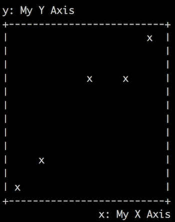
2. Label the axes
bashplotlib’s graphs are very clear, but the axes don’t have titles. This makes it hard to know what a graph is trying to tell you. Does that y-axis represent GDP growth or the amount of carbon it the atmosphere? Are the units percent, parts-per-million, or years-until-extinction?
Task
Let’s add the ability to optionally pass in titles for the x- and y-axes of scatterplots, and display these titles like so:
In addition, let’s add --xtitle and --ytitle options to the command line interface at the bottom of the scatterplot.py file so that the command line tool can use them too.
Tips
Feel free to tidy up the code a little if it helps you understand it. I personally felt like len(get_scale(xs, False, size) was being written out too many times, so I assigned its result to a variable at the top of the _plot_scatter function and used that throughout the rest of the function.
How I did it
Extensions
Save space and show off your skills by printing the y-axis title vertically down the side of the graph, like so:
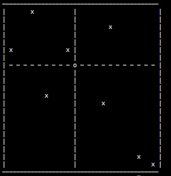
3. Show the 0-axes in the middle of the graph
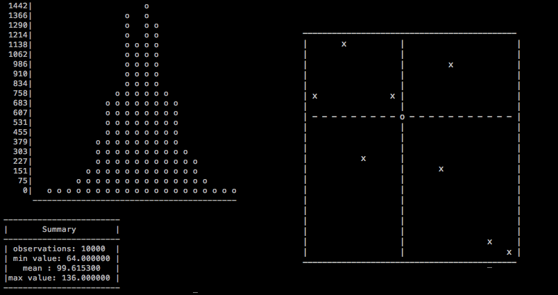
The README for bashplotlib shows an example scatterplot that has its “0-axes” (lines showing where the axes cross 0) displayed in the middle of the graph:
However, it seems that somewhere the code that creates these 0-axes got lost (nb. I did not delete the code for teaching purposes, it really does seem to have got lost).
Task
0-axes can be very useful for interpreting graphs, so let’s add them back in. Here’s how our 0-axes should work:
- If our data points cross the x-axis, we should print a 0-axis for the x-axis (eg. (-10, 10), (-5, 15), (0, 20), (5, 25)). If they cross the y-axis, we should print a 0-axis for the y-axis too (eg. (-10, -10), (-5, -5), (0, 0), (5, 5))
- We should only print a 0-axis if our data points cross 0 for an axis. If our data doesn’t cross 0, we shouldn’t print a 0-axis
- If we print 0-axes for both the x- and y-axes, we should print an
Owhere they cross - If there is a data point on top of an axis line, we should make sure to print the data point and not the axis line
Tips
When I was working on this feature myself, I realized that I had to actually work out what the double-nested-for-loop inside the _plot_scatter function was doing. Up until this point I hadn’t needed to, so I hadn’t bothered. I added a few comments and tweaked the code slightly to make it easier for me to understand. Feel free to do this yourself if it helps you.
How I did it
Extensions
Allow users to hide these new axes if they pass an optional hide_zero_axes argument into the plot_scatter function. 0-axes should be displayed by default, so the default value for this argument should be False.
4. Make the library “testable” and write some tests
Making changes to any codebase, especially a large, unfamiliar one, can be unnerving. You may have successfully added your new feature, but how do you know that it works correctly with every possible edge-case? And how do you know that you haven’t inadvertently broken an already existing feature in some subtle (or not-so-subtle) but important way?
The slow, unscalable, error-prone way to test your code is to manually run it using lots of different combinations of parameters, and laboriously check that everything looks correct. This is better than not testing at all, but does nothing to prevent someone else from unwittingly breaking your new feature in the future.
The solution is “unit tests”. A unit test is a block of code that calls functions from your main code, and verifies that these functions behave correctly. For example, if you wanted to check the correctness of a new function called sum_digits, which takes a number and returns the sum of its digits (in base 10), one of your tests might be:
result = sum_digits(543)
expected_result = 12
if result == expected_result:
print("SUCCESS!")
else:
print("FAILURE!")
print("Expected:")
print(expected_result)
print("Got:")
print(result)
You might also write other tests that make sure that sum_digits works correctly for other types of number, like negative numbers, decimals, and the number 0.
Unit tests make verifying the correctness of your code much quicker and more reliable - all you have to do is run your test file and make sure none of the tests fail. It also means that future people who work with your code (including yourself) will know how it’s meant to behave, and will be less likely to accidentally break it.
At Stripe, where I work, I would guess that the codebase has well over 10,000 tests, and maybe many more. This means that anyone can add new features and update existing ones, without being unduly concerned that they will unwittingly destroy the company.
Making bashplotlib “testable”
bashplotlib does not currently have any tests. This is a perfectly reasonable choice by the author. Writing and maintaining tests takes time, and he probably felt that the library was small and experimental enough that he didn’t want the bother. Nonetheless, adding tests would make the library more reliable and easier to work with. While I was writing this project I noticed and fixed a small bug that would have been caught automatically if the library had had any tests.
However, right now bashplotlib is not very “testable”. A piece of code’s “testability” is how easy it is to write tests for. There are many reasons why a piece of code might or might not be testable. bashplotlib’s main problem is that it prints all of its output to the terminal piece-by-piece. Automated tests for the current version of bashplotlib would have to somehow read in output that had previously been printed to the terminal. There are ways to do this (or something close to it), but they are somewhat complicated and fiddly. There is a better solution.
Task
In this task we’ll first make bashplotlib testable, and then we’ll write tests for it.
We’ll make bashplotlib “testable” by changing the _plot_scatter function so that it no longer prints the graph, but instead builds and returns the graph as a long string. The plot_scatter function (which calls _plot_scatter) will then be responsible for printing this long string to the terminal:
def _plot_scatter(...arguments, etc...)
graph = ""
# ...build a graph...
graph += "+---+etc"
# ...build the rest of the graph...
return graph
def plot_scatter(...arguments, etc...)
# ...process arguments...
graph_text = _plot_scatter(...arguments, etc...)
print(graph_text)
This seemingly minor shuffling of responsibilities makes the _plot_scatter function much easier to test. Now we can write test code that calls _plot_scatter, stores the result in a variable, and compares this result to a pre-defined, expected value. For example, in a new file called test.py, we can write:
# test.py
from bashplotlib import _plot_scatter
# Copy and paste the value for `expected_result`
# from terminal output that you know is correct.
expected_result = """+--------...
|
...etc...
|
+--------..."""
# Call `_plot_scatter` with the arguments that
# you know will produce the `expected_result`
# above.
result = _plot_scatter(...arguments, etc...)
if expected_result == result:
print("SUCCESS!")
else:
print("FAILURE!")
print("Expected:")
print(expected_result)
print("Found:")
print(result)
Think of as many edge-cases as you can, and write individual tests for them all.
Tips
I suggest that you tackle this task using the following steps:
- Change
_plot_scatterso that it returns a string representing the graph, and doesn’t print anything - Change
plot_scatterso that it stores and prints the output of_plot_scatter - Make a new file called
test.pyin the root of the library (alongsidescratch.py) - Write a test for
_plot_scatterto make sure that it generates a normal graph correctly. Run it usingpython ./test.py - Think of as many edge-cases as you can, and write tests for them. Do your 0-axes display properly? What if a point is on top of a 0-axis? What happens if your title is longer than the width of the graph? Is this what you want to happen? What if you have 2 data points that are the same? Almost the same?
Your tests might have trouble interpreting color printing. Feel free to get rid of the color-printing functionality for now, or look at my version for suggestions on how to deal with it.
For another example of unit testing, see section 3 of Programming Projects for Advanced Beginners #2: Game of Life.
How I did it
Extension
Research PyUnit, a Python testing framework, and rewrite our tests with it. Although our hand-crafted if-statements are perfectly serviceable, most test suites are written using a testing framework (like PyUnit), which makes writing, running, and debugging tests much easier.
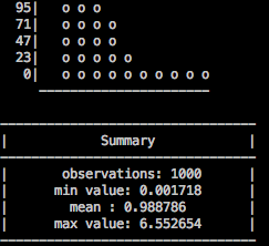
5. Make histograms more stylish too
So far all of our work has been on improving scatterplots. But bashplotlib can plot histograms too. Technically they’re not actually histograms; the y-axis in bashplotlib’s graphs represents a raw count, whereas in a histogram the y-axis represents “probability density”. “Bar charts” would be a more accurate word for what bashplotlib produces. But I think everyone still understands what the library is getting at, so let’s not say anything nasty on Twitter. For consistency I’m going to keep referring to them as “histograms”.
Task
bashplotlib’s histograms generate their titles using the same box_title function that we worked on in step 1, so they automatically benefit from our previous work. However, histograms also display a statistical summary of their data, in another box below the main graph. This box is generated by hand. We’ve already got a good way of printing text inside beautiful ASCII boxes, so let’s use this method here too. This will make our statistics look more elegant and consistent, and reduce code duplication
To work on histograms, you’ll have to call plot_hist from your scratch.py file. Try to set this up yourself.
Tips
We have a small problem - box_text currently assumes that you only want to print a single line inside your box, but our statistics are spread out over multiple lines. To solve this snafu, update box_text so that the argument it accepts is a list of strings, not just a single string. Have the function display each element of the list on a separate line, and surround all the lines with an ASCII box. We’ll then use the function to create our stats box like so:
center = ... # Defined earlier in the file
summary_lines = [
"## Summary ##".center(center),
("observations: %d" % n).center(center),
# ...etc...
]
print(box_text(summary_lines, center))
To maintain compatibility with our existing code, update the places where box_text is used for displaying titles so that the titles are passed in as a single element list, like this:
box_text([title])
How I did it
Extension
Because we’re now using the box_text function to render the histogram statistics box, we no longer get an emphasizing line in between “Summary” and “observations” (see picture above). I thought that line looked quite fetching, so let’s bring it back. Update box_text so that it takes an argument of a “list of lists”. box_text should print out each line in the sub-lists, as normal, but in between each top level list it should print an ASCII line. For example, the code:
box_text([
["Title"],
["Sub-title1", Sub-title2"],
["Point1", "Point2", "Point3"]
])
should produce the output:
+----------+
| Title |
+----------+
|Sub-title1|
|Sub-title2|
+----------+
| Point1 |
| Point2 |
| Point3 |
+----------+
Make sure all the other usages of box_text still work.
6. Add labels to histogram axes
Task
Do the same thing that you did in task 2 - add optional titles to the x- and y-axes - but this time for histograms. It’s a lot easier the second time round, isn’t it?
Tips
You’ll probably find that you repeat code between the scatterplot.py and histogram.py files. Repeating code like this should always make you feel a little bit uncomfortable, and should prompt you to consider ways to reduce or eliminate the duplication. That said, sometimes repeating code can be an entirely pragmatic choice.
In our situation, we could either try to wrap up our axis title code in some sort of print_axis_title function that lives in utils/helpers.py, or we could copy and paste and duplicate our code in both scatterplot.py and histogram.py. For this task, I could personally go either way. On the one hand, it’s always good to reduce repeated code. But on the other hand, it’s not obvious to me that scatterplots and histograms will always and forever want to use the same logic for printing their axis labels. For example, what happens if one of them wants to print some extra characters on the same line as the axis label? We’d probably have to add something convoluted like optional extra_chars_left and extra_chars_right parameters. Trying to combine two pieces of code that might not be as combine-able as they first appear can lead to some awkward approaches. Since the code for printing axis labels is relatively simple anyway, on this occasion I lean in favor of copying and pasting.
I’m still glad that I thought about it though.
How I did it
I reckon you can tackle this one on your own.
Extension
I’ve got nothing. Call your parents and see how they’re doing.
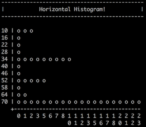
7. Make a new graph type: horizontal histogram
This is my final feature request, and it’s a big one.
Task
Let’s allow users to draw horizontal histograms:
This will help users display big, detailed histograms that are too tall for their short and stocky terminals, but that fit nicely when rotated.
Tips
This will be very hard. Take inspiration from histogram.py, but not too much inspiration. Feel free to start from scratch if you prefer. I’d suggest that you:
- Copy and paste
histogram.pyinto a newhorizontal_histogram.pyfile - Make sure you can import
horizontal_histogram.pyand run its code inscratch.py. Test it by using it to draw some normal, still-vertical histograms - Think about which parts of the vertical histogram code you can reuse, and which parts will have to change. In general you’ll be able to reuse the parts of the code that deal with transforming and bucketing the data (everything above line 140 or so), since the underlying data doesn’t change. However, you will have to rewrite the parts that take the transformed data and display it as a graph (everything below line 140). For now, use copy and paste liberally and don’t worry about duplicating code.
- Once you’ve got your horizontal histogram working, write some tests for it!
How I did it
Extensions
Pull out as much duplicated code as you can from vertical and horizontal histograms, and move it into shared functions. These functions might perform common operations like bucketing data points and calculating scales.
8. Even more extensions
- Calculate the “correlation” of scatter graphs using the “product moment correlation coefficient” algorithm and print it in a box below the plot. Research what these words mean. You can either look for an existing implementation of the algorithm and use that, or try to code it yourself from scratch (this involves a lot of very tricky but very interesting maths).
- Calculate the “interquartile range” of histogram data and display it in the same box as the mean, median, standard deviation, etc. If you’re not sure what that means, look it up!
- Use ASCII techniques to connect the dots in scatter plots. You’ll have to work out which points need to be joined together, calculate the gradient between them, and work out how best to connect them using ASCII characters.
- Draw ASCII pie charts. Add a new
bashplotlib/pie_chart.pyfile to put the logic in, and add a newpiecommand-line tool
That’s it
You’re done! Keep the momentum going - choose another open source project (use Google and this list for inspiration) and add experimental new features to it. Don’t worry much about actually submitting your work to the main project (unless you want to) - your goal should be to understand and experiment with new projects, not to produce something polished and perfect and ready to be deployed to production servers. Alternatively, try tackling the Programming Projects for Advanced Beginners series, where you build your own programs from scratch using a similar level of detailed (but not too detailed) guidance to that of this project.
I’d love to hear your feedback and find out how you got on. Send me an email or a Tweet (with a link to your GitHub repo if you have one) and I’ll send you back some insightful comments and a ASCII art trophy.
Subscribe to my new "Programming Feedback for Advanced Beginners" newsletter to receive concise weekly emails containing specific, real-world ways to make your code cleaner and more professional.
Each week I review code sent to me by one of my readers. I highlight the things that I like, discuss the things that I think could be better, and offer suggestions for how the author could make their code cleaner and easier to work with.
Subscribe now to receive these invaluable improvements in your inbox every week, completely free.